EM-27
A visual brand language analysis of Teenage Engineering
Using Teenage Engineering's visual brand language,
I asked the question: "What if TE made an espresso machine?"
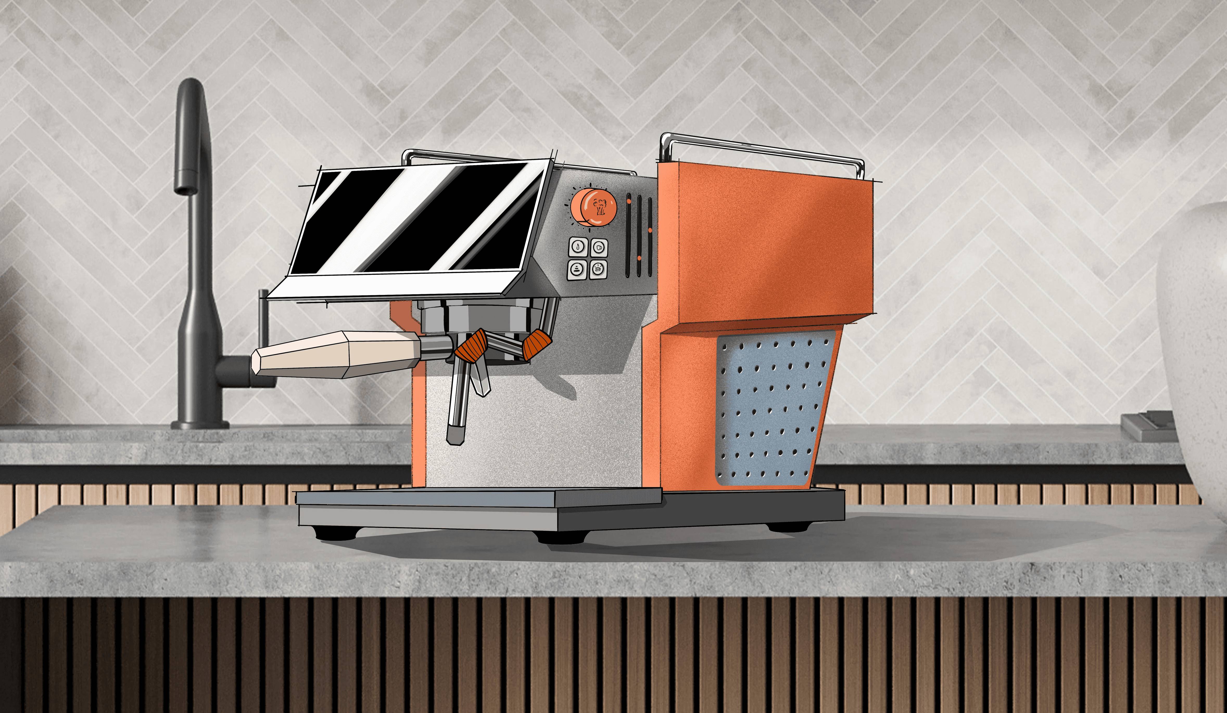
Highlighting the product with a sleek appearance, a large LCD screen, and an orange and grey colorway, this machine is reminiscnet of many existing products.
Perspective view
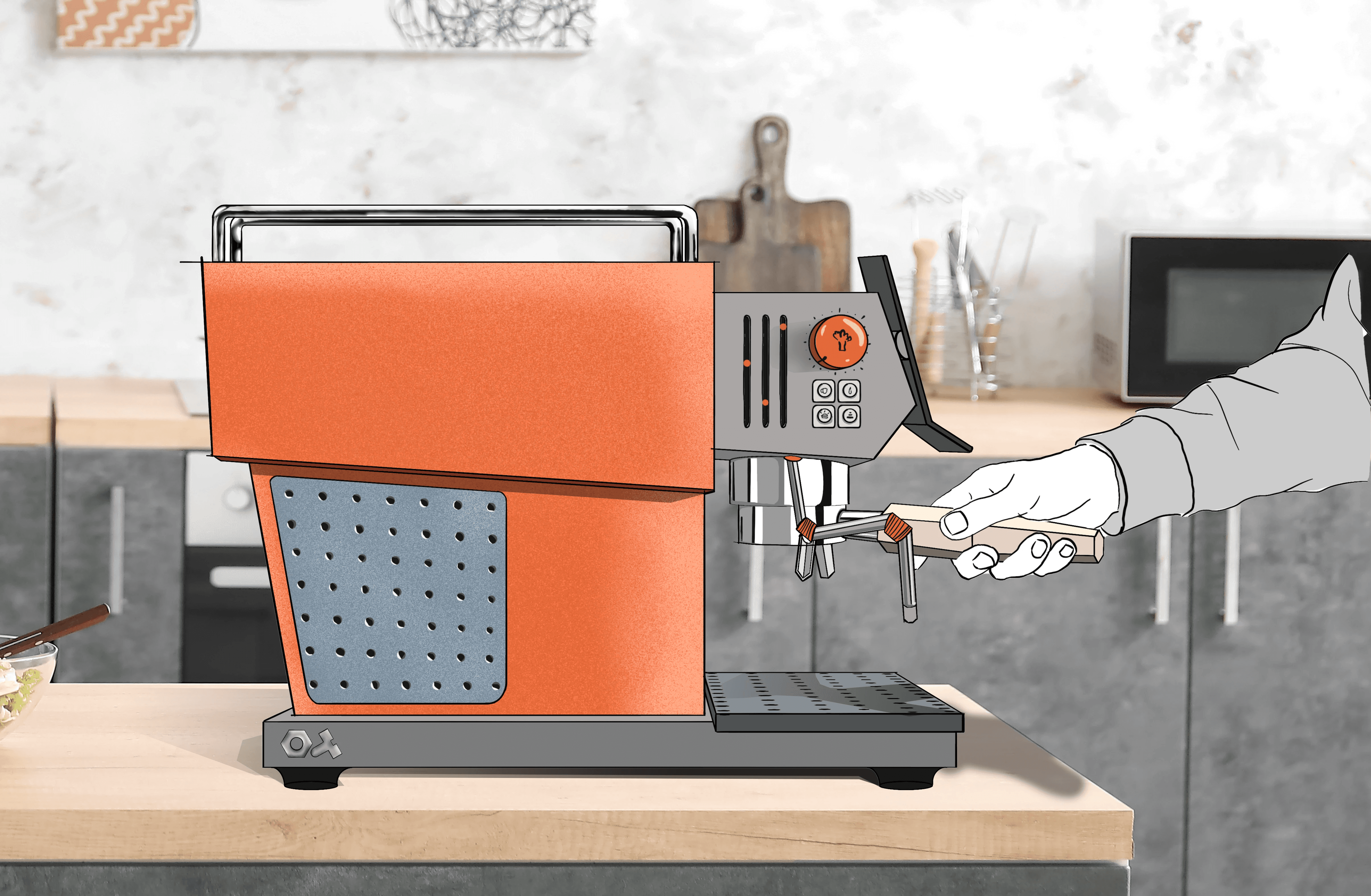
Similar to any manual espresso machine, the EM-27 has a standard portafilter, with a hexagonal design that fits nice in the hand.
Side View
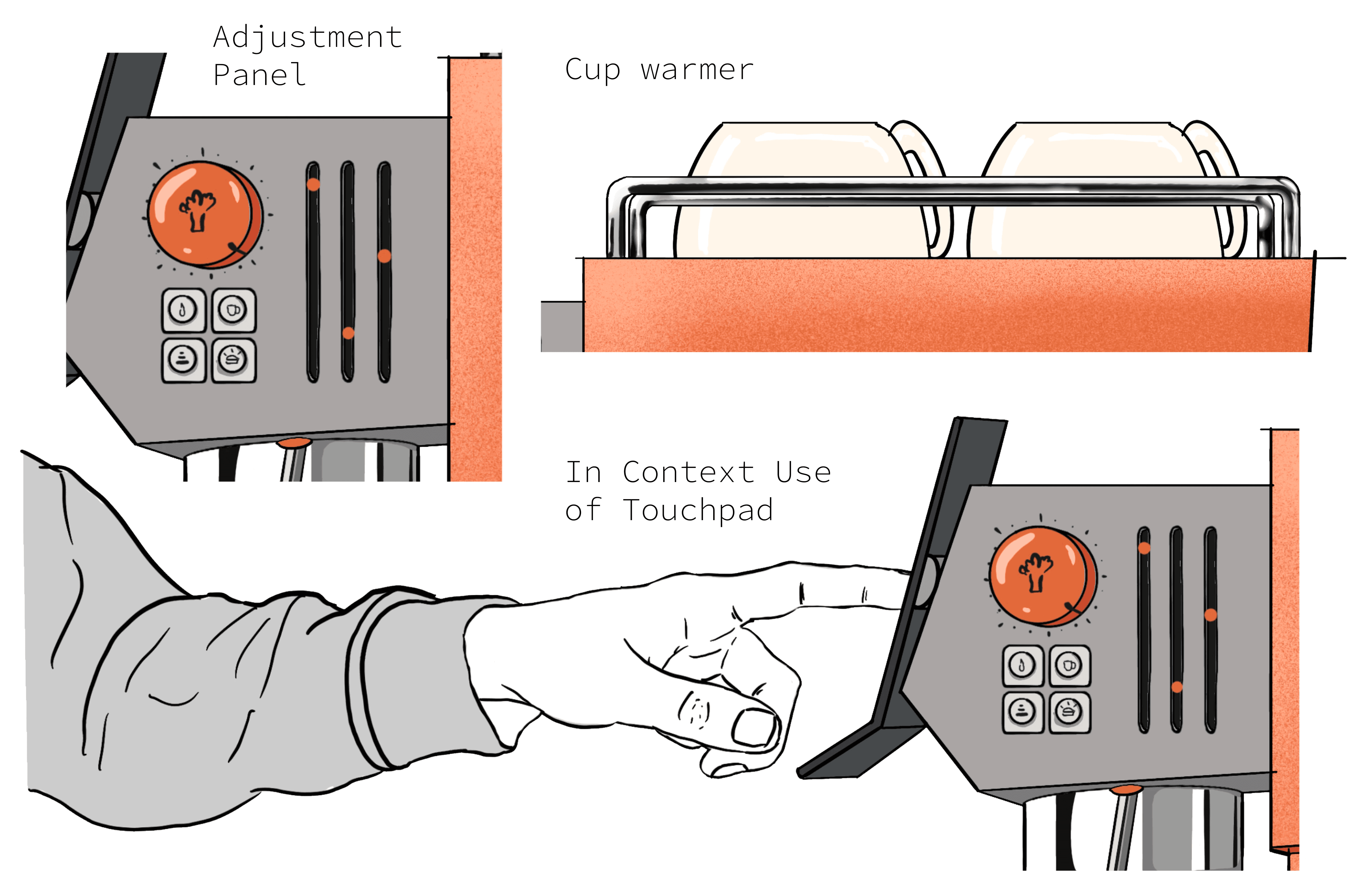
The large touch screen features all kinds of customization, and the buttons and sliders on the side provide further access to steam, hot water, and other changes.
On top of the machine, metal rods frame the cup warmer, useful for storage and keeping your cups steamy.
Side View

A deeper dive into the VBL (visual brand language). The orange, cream, and grey color pallete, the knobs, and the overall grid layout are all visable in the EM-27
VBL Deep Dive

A first attempt to quickly ideate for the machine, I looked to famous contours of existing machines, and incorperated aspects from TE that I discovered from my deep dive.
Rapid Sketches
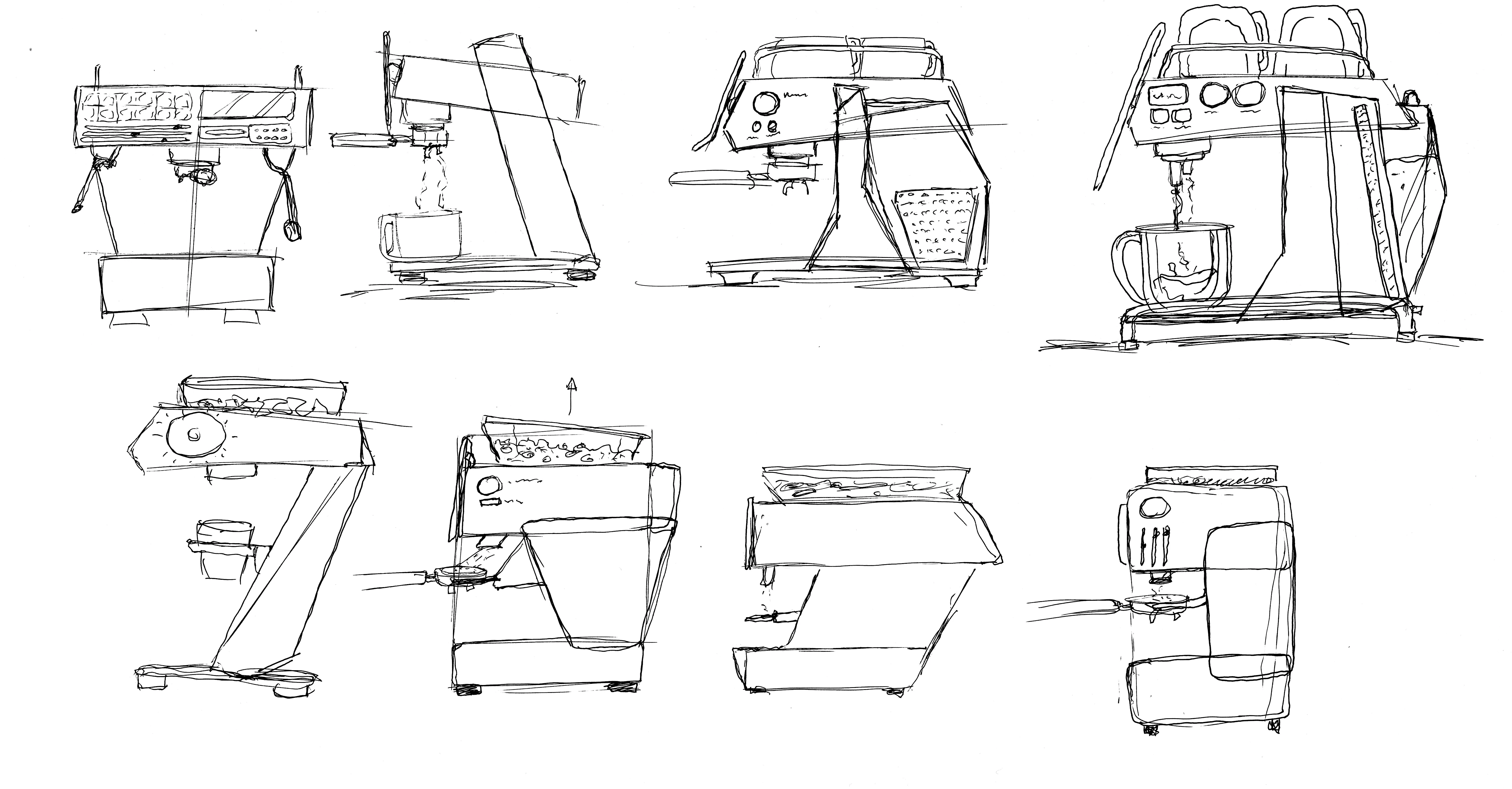
Before doing the final sketch, I sketches on paper to see how the forms fit the brand language.
Paper Ideation
